
“Brand ecosystem” is one of those phrases that gets thrown around a lot in the agency world.
But strip away the jargon and the principle is simple; how do you create designs that complement the reality of an experience, are unique, yet still feel part of an existing brand family?
Where to start: understanding the power of a brand ecosystem
A brand ecosystem is a family of identities that share underlying values and a creative language that links it all together, but expresses them differently depending on the audience and occasion they serve.
For anyone building a brand ecosystem whether for a hotel, a restaurant group, or any hospitality business with a diverse offering, here’s how we’d approach it…
1 Establish the master brand’s non-negotiables
What are the values, the tone, the visual codes that absolutely must carry through?
2 Define each concept independently
What is its audience? Its occasion? Its personality? What would it feel like to walk through the door?
3 Find the shared metaphor
Is there an idea that can stretch credibly across all concepts without becoming tired or out of place?
4 Map the creative territory
What is the right level of formality, energy, colour and tone?
5 Name with intention
What does the name truly say about the experience at hand?
6 Design the world, not just the logo
For us, it’s all in the details. Refined logo suites, colour palettes, typographic systems and touchpoint guidelines ensure the identity works at every guest interaction.
Why it matters: thinking beyond the aesthetics of a brand
A well-designed brand sets a guest’s expectation at the point of discovery, and before they walk through the door.
When a brand does this effectively, the experience feels cohesive and considered. When it doesn’t, there’s a nagging sense of disconnect or disappointment that’s hard to articulate but impossible to ignore.
Our ambition for any brand ecosystem is always to deepen the story and give guests a way into the world of the brand right from the get-go.
Case study: A brand ecosystem for Cromlix
That challenge sat at the heart of our work with Cromlix, the five-star Scottish country house hotel owned by Kim Murray and Sir Andy Murray OBE.
We’ve had the privilege of working with the team behind Cromlix to define and bring to life the identities of two entirely new restaurants: Cradle, an intimate 16-cover fine-dining experience, and The Garden Room, a relaxed 65-cover modern bistro.
But before the visual world took shape, there was a lot of strategic thinking to do.
Our approach for Cromlix: strategy first, always
The temptation with any new restaurant brand is to jump straight to the visual. What should the logo look like? What’s the colour scheme? What font says “fine dining” vs “causal” vs “intimate”?
But whatever the context, before you can design anything, you need to understand what you’re designing it for.
At Cromlix, the strategic questions were rich and genuinely complex.
Who is dining here and what are they looking for?
How do two very different restaurants coexist without one undermining the other?
How closely should they align with the Cromlix master brand?
“Our role was to define the strategic foundations first — the opportunity, the ambition, what each dining concept represents, how it feels to dine there, and the audience it speaks to,” said Chris Bosher, Strategic Lead, Thissaway.
“That last question is one that comes up repeatedly in hospitality design briefs. A hotel that develops a restaurant which simply echoes its own identity risks feeling uninspired – like a sub-brand rather than a destination in itself. But take it too far from the master brand and likewise, you risk feeling disconnected. The answer lies in building a brand ecosystem rather than a brand hierarchy,” said Ed Potter, Chief Creative Officer, Thissaway.
Cradle and The Garden Room are both unmistakably Cromlix, but they speak to different types of guest experience and different types of guest.
The two restaurants: new identities, at a glance
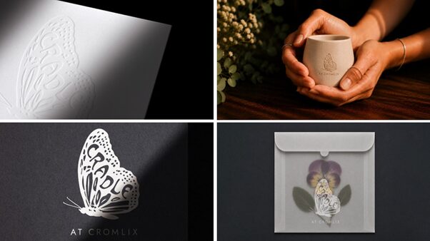
Cradle – A place of escape and culinary discovery. Monochromatic with sage accents, art nouveau typeface, butterfly marque. This fine dining establishment has 16 covers and operates as evenings and Sunday lunches only.
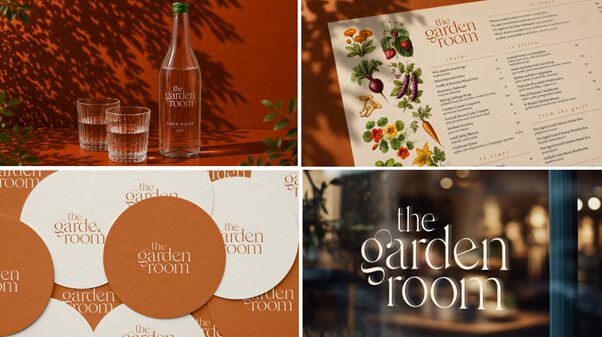
The Garden Room – A relaxed, seasonal and produce-led. Cinnamon and natural stone palette, soft lower-case wordmark. This modern bistro has 65 covers and operates all day.
Finding the shared thread was central to creating this ecosystem for Cromlix.
At Cromlix, that thread was nature. The estate’s 34 acres of woodland, its kitchen garden and its grounds aren’t just a nice backdrop but as the source of true inspiration that feeds into every aspect of the hotel.
In our mind, if the food comes and the interior design inspiration also came from the hotel’s sense of place in nature, then the visual identity for its new restaurants needed to as well.
With that thread established, the creative work becomes a question of expression…
How does nature manifest differently for each restaurant – in both name and aesthetic?
For Cradle, nature is about transformation — seasonal cycles, the alchemy of cooking, the cocoon-like quality of a truly immersive dining experience. The butterfly marque makes that metaphor explicit without being heavy-handed.
For The Garden Room, nature is about provenance and abundance — the feeling of eating something that was growing nearby this morning, presented simply and confidently. The lowercase typography and energy within the flourishes of the font evoking a sense of vibrant growth.
For our team, that same source material led to very different creative expressions.
We’re proud of what we’ve created with the Cromlix team, and genuinely excited to see both restaurants come to life as culinary destinations in their own right.
You can read more about this project in our Design Week feature, or head over to our case studies for a look at how branding projects develop.
If you’re thinking about a brand ecosystem for your own hospitality business, we’d love to talk.